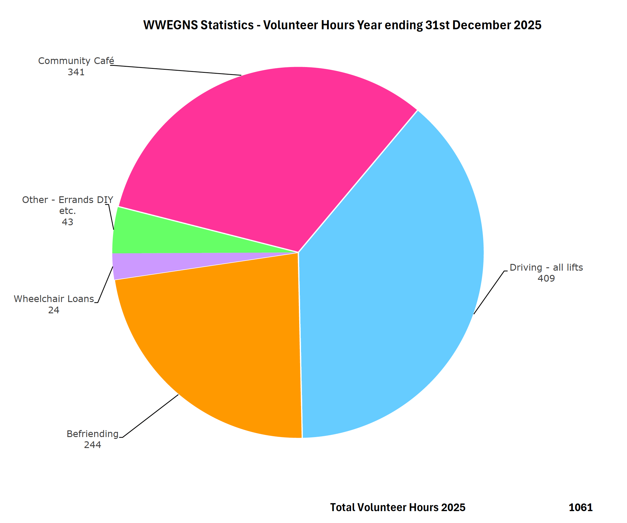
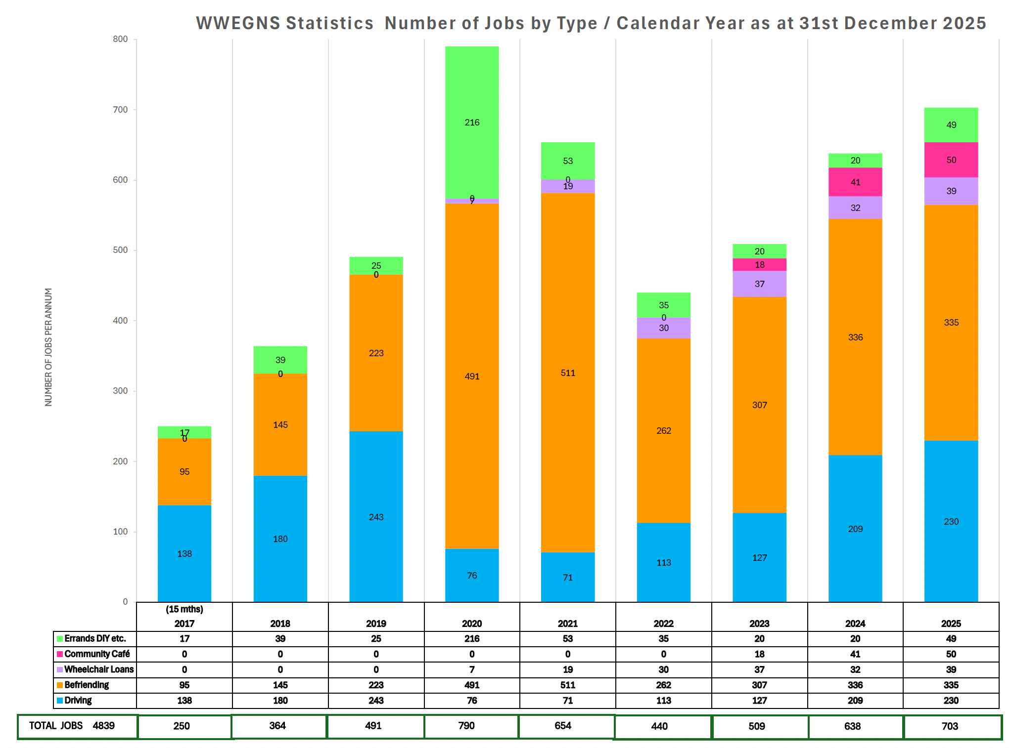
We think it’s important to record the number of times we help our neighbours – we call these “jobs” for want of a better term! We also record the amount of time our wonderful volunteers willingly give up to help others. This information is useful for the steering group to see whether we have enough drivers to meet demand, for example, and is also useful when applying for grants.
The pie chart shows the number of hours spent in the current year, whilst the bar chart shows the number of jobs over the years.


